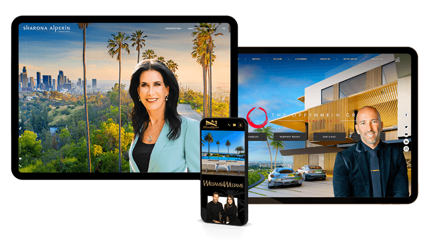
53 Real Estate Website Call-to-Action Examples That Drive Results
Even with steady traffic, many real estate websites miss opportunities to turn interest into action. The right real estate call-to-action (CTA) can guide visitors more smoothly through their journey, whether they’re exploring listings, evaluating their home’s value, or considering reaching out.
This guide will show you how to create clear, effective CTAs that align with what buyers and sellers are actually looking for, plus give you a full library of real estate-specific examples you can use right away.
Make it easier for clients to contact you.
Strong CTAs help the right people take the next step, minus second-guessing.
Table of Contents
Why CTAs Matter on Real Estate Websites
Call-to-action (CTA) elements serve a functional role in digital marketing, especially for real estate websites where user decisions often follow a multi-step journey. A well-placed CTA helps transition a passive visitor into an engaged lead by guiding them toward specific, desired actions.
CTAs and conversion behavior
Most real estate website visitors fall into one of several categories: buyers researching listings, sellers evaluating agents, or individuals seeking more information about the market or services. Without clear guidance, these users may abandon the site without engaging further. CTAs create directional momentum and reduce friction in the user journey.
Examples include:
-
Prompting buyers to “View Available Homes”
-
Inviting sellers to “Get Your Home Value”
-
Encouraging general inquiries through “Contact an Agent”
Functional purpose beyond design
CTAs are not decorative or optional. They contribute to:
-
Lower bounce rates
-
Higher lead form submissions
-
Greater time on site
-
Improved click-through behavior
They also play a crucial role in mapping out conversion paths that connect landing pages, property listings, and lead capture forms into a coherent, goal-driven structure.

CTA Best Practices for Design and Copy
A good call-to-action (CTA) doesn’t just tell people what to do, but it also shows them what happens next, why it matters, and why they should care. Let’s break down what makes a real estate CTA perform well from both a copywriting and design perspective.
-
Use clear, actionable language
The best CTAs use clear, direct language that lines up with what someone’s already thinking about. Generic words like “Submit” or “Click Here” don’t offer any real reason to act. Instead, make it specific and goal-oriented. For example:
-
❌ Learn More vs ✅ See Homes Now
-
❌ Submit vs ✅ Get My Home Value
Think of it this way: if your button could talk, would it make sense out of context? The clearer, the better.
-
-
Keep it short, but not empty
Short CTAs typically perform better, especially on mobile. An ideal range is 2–5 words, using simple language. Avoid jargon, overly clever phrasing, or anything that adds too much mental effort. Simple and specific wins.
-
Make it easy to spot
Button design should prioritize visibility without clashing with the overall brand palette. In other words, they need to stand out. This doesn’t mean they have to be flashy, though. Effective design considerations include:
-
High color contrast between button and background
-
Sufficient padding and spacing around the element
-
Consistent visual hierarchy across the site
-
-
Don’t forget the mobile experience
Given that mobile users represent a significant share of real estate traffic, mobile-first CTA planning is essential. A mobile-friendly CTA should have:
-
Thumb-friendly button sizing
-
Enough space from other buttons to avoid misclicks
-
Fixed or sticky placement on scroll, if possible
-
-
Use strategic placement on your site
Even the strongest CTA won’t convert if it’s hidden or buried. Think about where someone is likely to take action and place your buttons there. Some smart spots are:
-
Top of page (above the fold) to catch early interest
-
Mid-content CTAs after listings, reviews, or explanations
-
Footer-level CTAs that reinforce engagement at the end of scroll
-
Contextual placements such as after a video or neighborhood guide
Proper placement ensures visibility without interrupting user flow, and encourages action at logical decision points.
-
Improve engagement on every page.
Simple changes to your CTAs can boost clicks, calls, and conversions.
Writing CTAs to Match Buyer and Seller Behavior
While CTA buttons might look similar on the surface, the logic behind them should reflect the specific needs, goals, and decision-making patterns of the people clicking them. Buyers and sellers interact with your website differently, and your CTA copy should account for that.
Buyers—especially online—tend to behave like explorers. They browse listings, scan photos, compare neighborhoods, and often return multiple times before taking action. Their behavior is curious but cautious, and they’re often in research mode. On the other hand, sellers typically have a more outcome-oriented mindset. They’re goal-driven and usually more focused: “What can I sell for?”, “How long will it take?”, or “Who should I trust to list my home?”
Adjusting based on funnel stage
It’s also useful to think in terms of where the visitor is in their decision process:
-
Top-of-funnel visitors need low-commitment CTAs (“Start Here,” “Browse Options”)
-
Mid-funnel visitors are comparing. Use value-driven CTAs (“See What Sets Us Apart”)
-
Bottom-of-funnel visitors are closer to action. Use urgency or scheduling (“Request a Tour,” “Talk to an Agent”)
53 Ready-to-Use Real Estate Website Call-to-Action Examples
CTAs for Buyers
Search & browse actions:
-
Search Homes Near Me
-
Explore Homes by Price
-
Find Homes with [Feature, ie. Pools]
-
See Properties with Virtual Tours
-
Browse Newly Listed Homes
-
See What's Available in [Neighborhood]
-
View Featured Listings
-
Search Homes by Lifestyle
Touring & appointment actions:
-
Schedule a Private Showing
-
Book a Virtual Tour
-
Request a Walkthrough
-
Book a Home Tour
-
Add to My Viewing List
-
Request Open House Details
Intent-driven engagement:
-
Match Me with Similar Properties
-
Help Me Find the Right Home
-
Build My Dream Home Wishlist
-
Save My Search Criteria
-
Save This Property
CTAs for Sellers
Home valuation & comparison:
-
Find Out What Your Home Is Worth
-
Instant Home Value Estimate
-
Compare My Home to Nearby Sales
-
How Much Could I Sell For?
-
View Recent Sales in My Area
-
Check Local Market Conditions
Consultation & listing services:
-
Talk to a Listing Specialist
-
Book a Free Home Selling Consultation
-
List with a Local Expert
-
Start My Home Selling Plan
CTAs for Contact and Reaching Out
-
Call Now to Speak with an Agent
-
Message a Local Realtor
-
Book a Free 15-Minute Call
-
Message Us Anytime
-
Send a Quick Message
-
Have a Question? Ask Now
-
Reach Out to Our Team
-
Live Chat with a Real Agent
CTAs for Offers, Pop-ups, and Lead Magnets
-
Get Your Free Buyer’s Guide
-
Get a Copy of Our Home Prep Checklist
-
View the Step-by-Step Home Buying Timeline
-
Access the Ultimate Seller’s Guide
-
Download the Relocation Guide for [Area]
-
View the Full Home Staging Handbook
Scroll-Triggered & Time-Delayed Pop-Up CTAs
If they’re on a listing page:
-
Save This Property for Later? Enter Your Email
-
Get Notified if the Price Drops
-
Request a Virtual Tour Before This Home Sells
-
Want Similar Homes Sent to Your Inbox?
If they’re on a blog or guide:
-
Like This Guide? Get the Full [Topic] Workbook
-
Download the PDF Version to Take With You
-
Get Weekly Articles Like This Straight to Your Inbox
-
Want Local Tips Like These? Subscribe to Our Updates
If they’re on an about/contact page:
-
Ask Us Anything Before You Go
-
Not Ready to Talk Yet? Let’s Email You Some Info
Good design gets noticed. Great design makes people stay.
Let’s make your real estate website the one clients remember.
Frequently Asked Questions
The most effective way to find out what works is through A/B testing. This involves creating two versions of a real estate website call-to-action—such as different button text, colors, or placements—and showing them to different sets of visitors to see which performs better. Even small tweaks like changing "Get Alerts" to "Send Me New Listings" can impact how users respond and help you identify which CTA drives more clicks and leads.
A CTA button is typically used to guide users toward a quick next step, such as opening a popup, navigating to a different page, or revealing more information. It acts as a prompt rather than a commitment. A lead form, on the other hand, is designed to collect contact information—like a name or email address—usually in exchange for something valuable, such as a free report or a consultation. Use buttons when you're easing users forward in their journey, and lead forms when you're ready to capture a more serious level of engagement.
You can reuse strong-performing CTAs across multiple pages, especially if they tie into core actions like starting a home search or requesting a home value estimate. However, tailoring CTAs to match the specific content or user intent of each page can lead to better engagement. For instance, a CTA on a listing page might mention scheduling a tour, while a CTA on a market trends article might focus on checking your home's current value. Consistency is helpful, but context always makes the message more compelling.
Yes, and the difference comes down to focus. Landing pages are typically built for one specific goal—like downloading a buyer guide or booking a call—so the CTA needs to be clear, singular, and visible. There’s usually less competing content, fewer links, and a more direct message. In contrast, a homepage or neighborhood guide might have multiple CTAs serving different purposes, such as searching listings, requesting a valuation, or reading more content. In that case, each CTA should still be intentional, but the messaging can adapt to the broader context of the page.

Let’s Make Your Website Work Smarter
A strategic CTA can make the difference between a visitor who bounces and a lead who books. Whether you need help crafting better copy, designing conversion-focused pages, or building a smarter user journey, we’re here to help. Our team specializes in real estate websites that not only look great—but guide people to take action.
Call 800.979.5799 or fill out our contact form to get started with a free design consultation.