Real Estate Website
Redesign & Transformation
We Make Your Agent Sites Look Amazing

Before & After
A website redesign can make a world of difference — not just to your brand, but also to your business. As you can see in these before & after examples, we specialize in helping agents and brokerages reinvent their online presence for a digital-first landscape. With beautiful designs, intuitive layouts, and cutting-edge features, these websites embody the award-winning expertise of Agent Image.
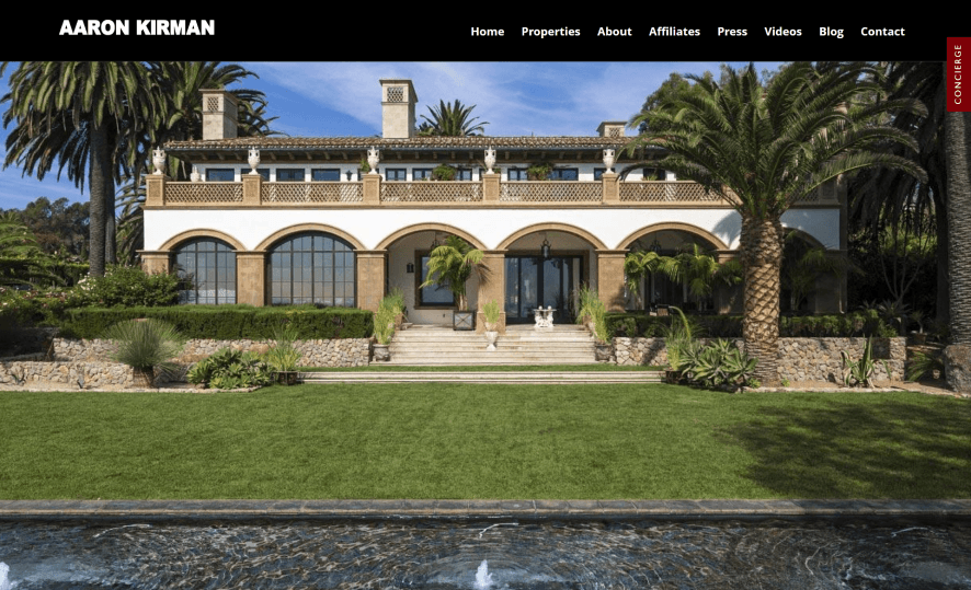
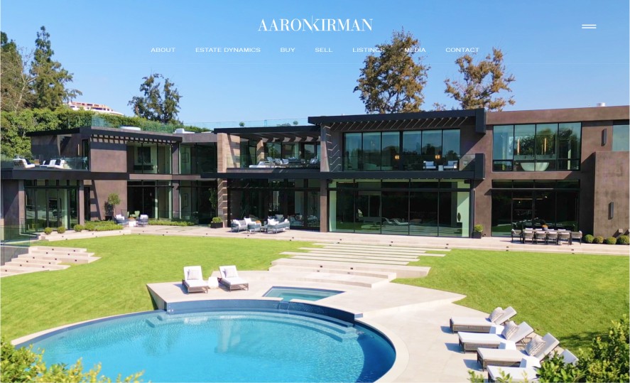
Our task was to create a signature look for Aaron Kirman — one that embodied his iconic status in luxury real estate. More than just designing a website, we created a virtual showroom for Aaron’s achievements. We accomplished this by crafting a striking, high-contrast design that has a distinctly futuristic vibe — a fitting look for this tech-forward agent.
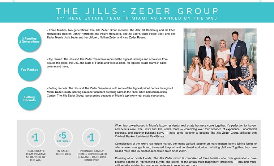
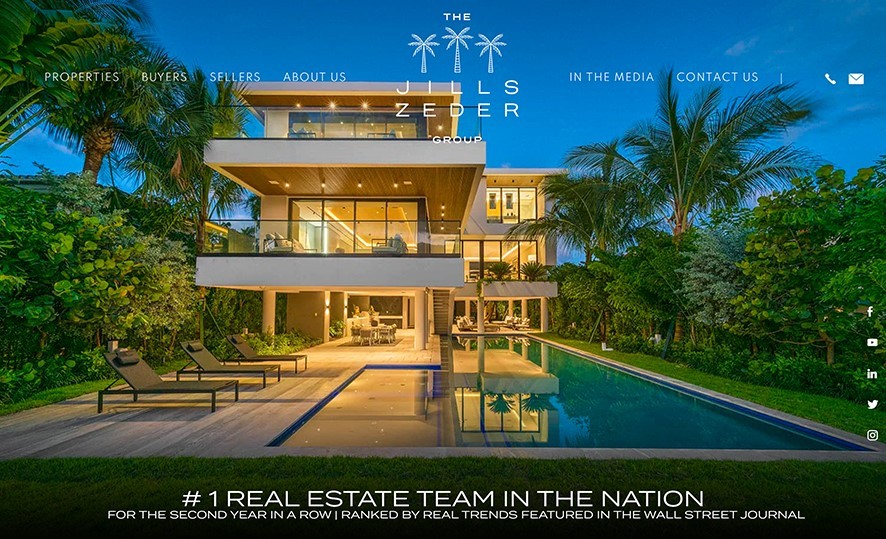
The Jills Zeder Group wanted a website that reflected its prestigious past while also making a bold statement on its exciting future. Agent Image crafted a website that exudes luxury from top to bottom, while also incorporating contemporary design touches. We likewise made sure to follow their existing brand guidelines, using them as a jump-off point for a fresh new look.
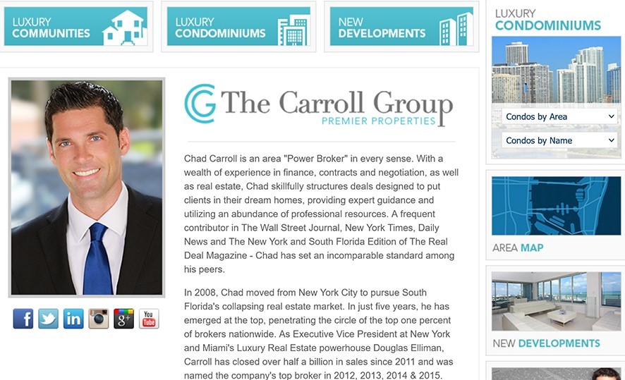
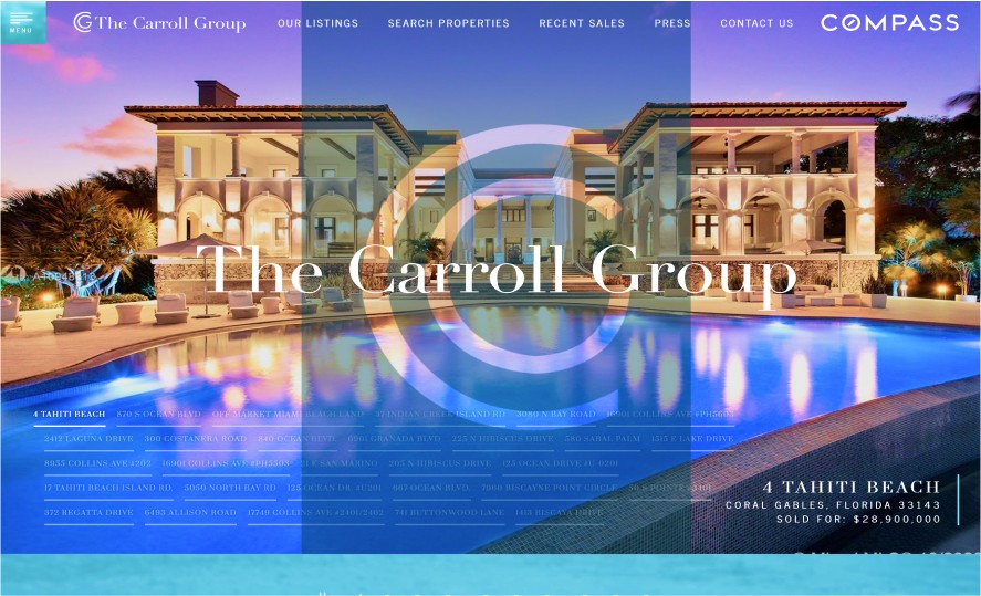
Chad Carroll approached us with a simple yet challenging request: to make a website that’s ultra-luxurious without being stodgy or old-fashioned. The website we made has an artful yet avant-garde look that features asymmetric shapes and bold colors. The generous use of white space also lends the project an almost gallery-like feel.
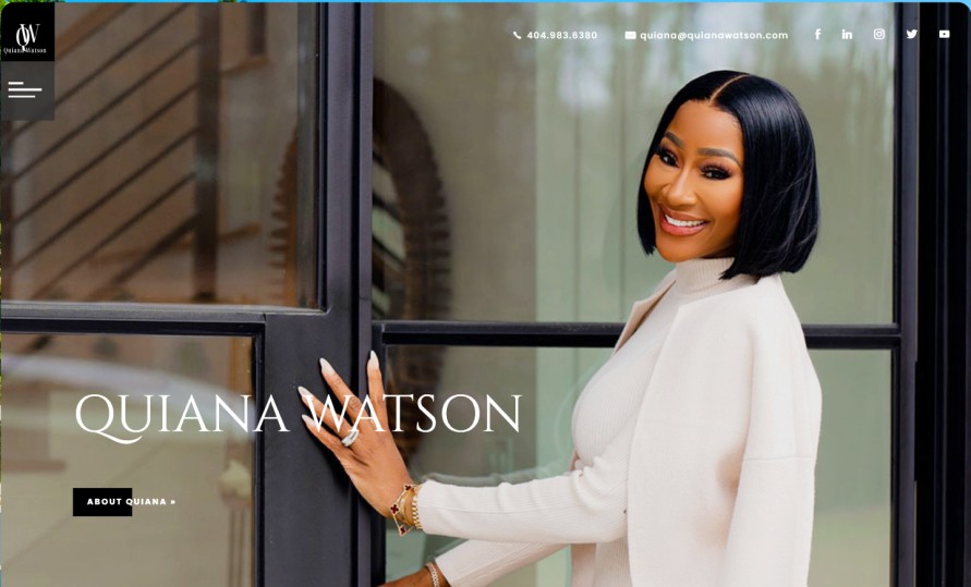
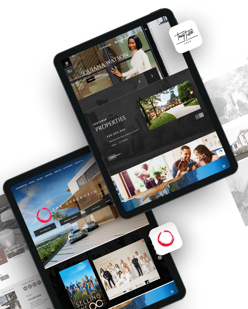
To help highlight her expertise in high-end real estate, Quiana Watson needed a website that oozed deluxe appeal. Our team decided to use an editorial approach to give this website an effortless elegance. Her site has the look of a glossy magazine and gives a peek at the good life that awaits if you purchase one of her luxury listings.
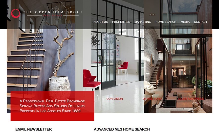
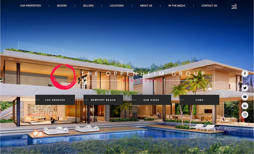
The Oppenheim Group needed a website that captured its sterling reputation as luxury real estate experts. Our chosen design direction exudes a bold and confident look — just like The Oppenheim Group. The interplay of black-and-white and bold red colors represent the deft touch and passion this world-famous team is known for.
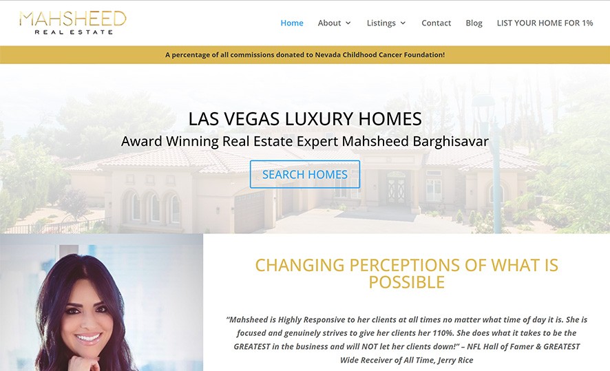
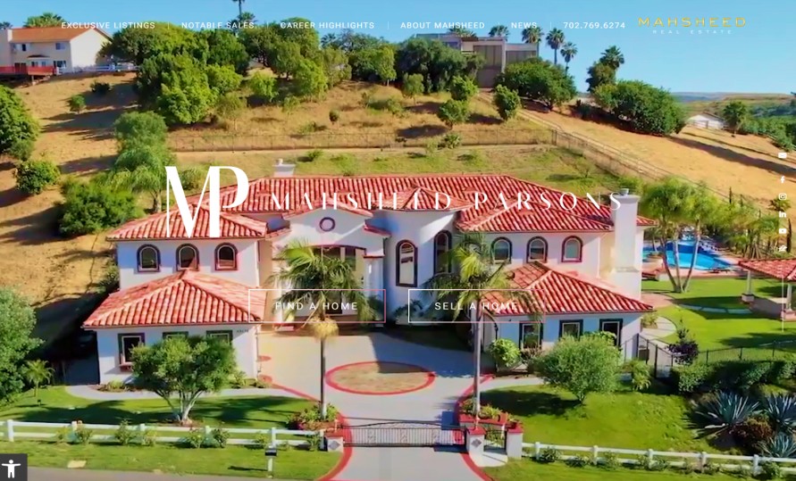
Mahsheed Parsons wanted a website that embodies her luxury brand while elevating her online presence. Agent Image reimagined her site with a sleek, contemporary design that blends elegance with functionality. The new site captures her vibrant personality and showcases her portfolio with immersive visuals, intuitive navigation, and refined branding elements, positioning her as an industry leader in the high-end real estate market in both Las Vegas and Southern California.
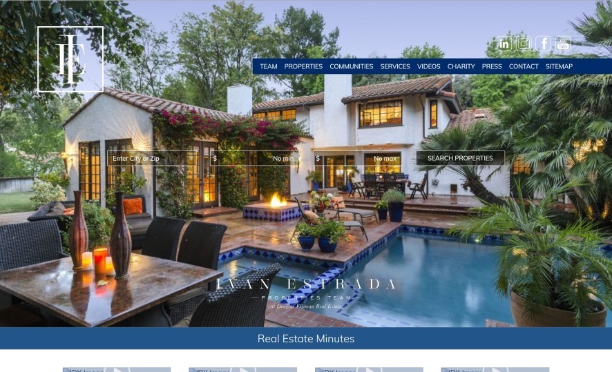
Young and successful, Ivan Estrada requested a website that announces the arrival of an up-and-coming luxury real estate mogul. Ivan’s website is the height of contemporary sophistication thanks to its sharp lines and geometric shapes. The dynamic parallax animation reflects the passion and energy this top agent brings to the table.
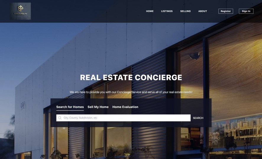
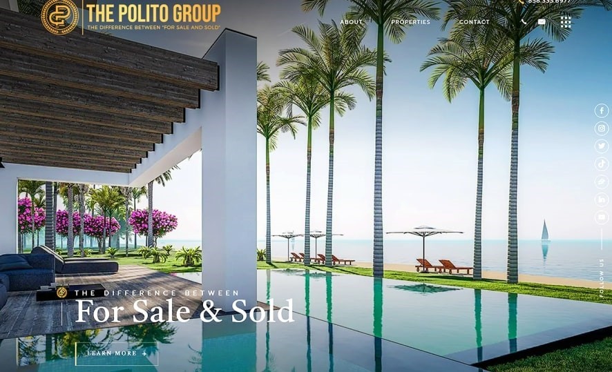
This luxury agent wanted a website that captured his big personality and passion for the finer things in life. Gilded glamor meets straightforward navigation on Simon Polito’s website. Our design manages to embody the top agent’s affable personality without scrimping on deluxe details.
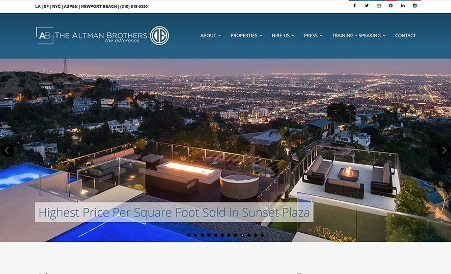
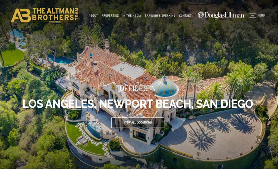
The Altman Brothers wanted a pared-down website without sacrificing a strong sense of style. We took a minimalist approach to this project, eschewing layers, shapes, and textures in favor of streamlined yet bold design elements. This website is undeniable proof that less can truly be more.
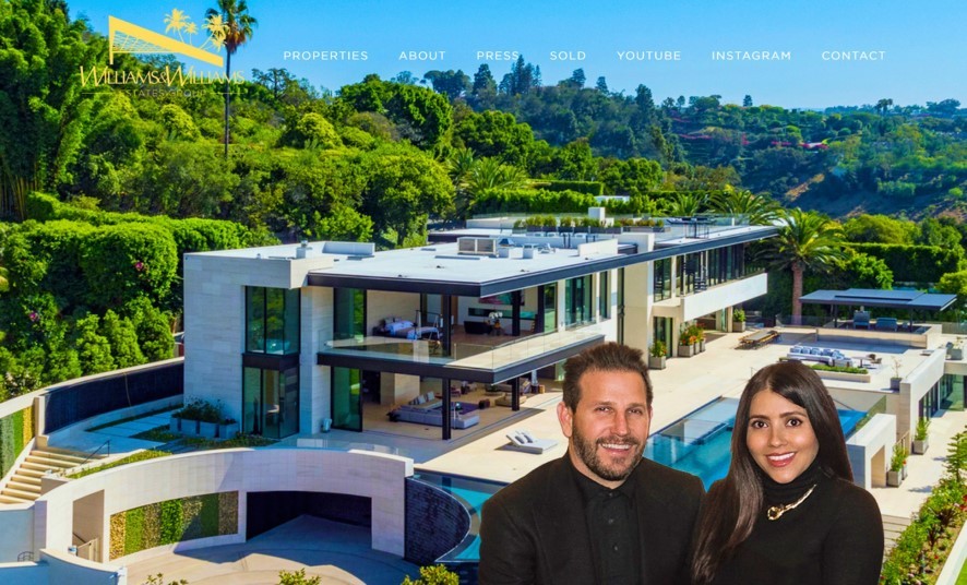
For this project, Williams & Williams wanted to evolve their website from functional to fantastic. Our goal was to make TheWilliamsEstates.com the little black book of luxury real estate. We brought this idea to life by using sleek layouts, gilded design elements, and sophisticated simplicity.
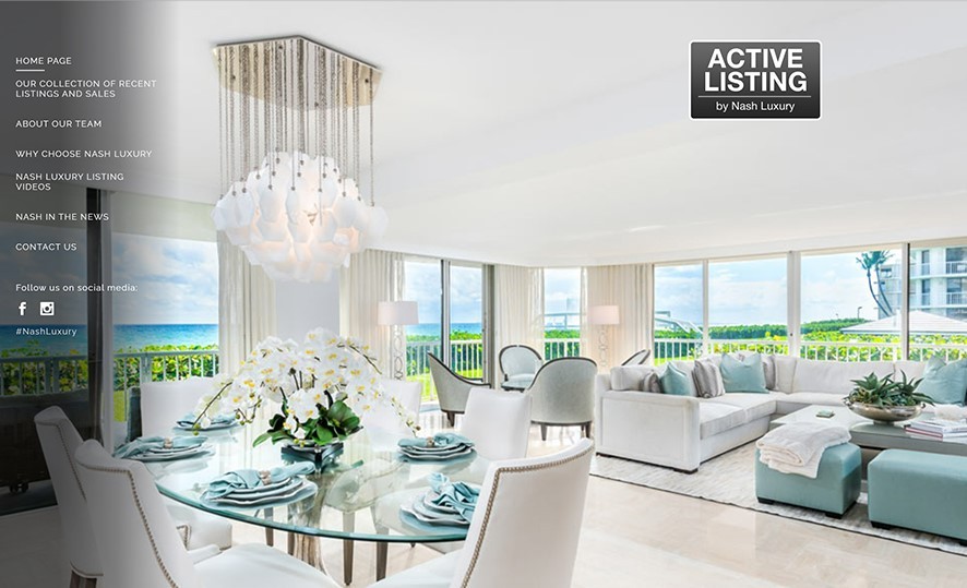
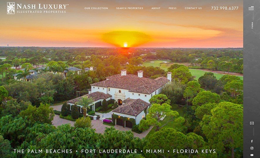
Billy Nash requested a website that marries his warm personality and his expert handling of high-profile clients. In response, we created an elegant website that’s not only eye-catching but also offers a seamless browsing experience. These two characteristics express the concierge-level service that only an agent of Billy’s caliber can provide.
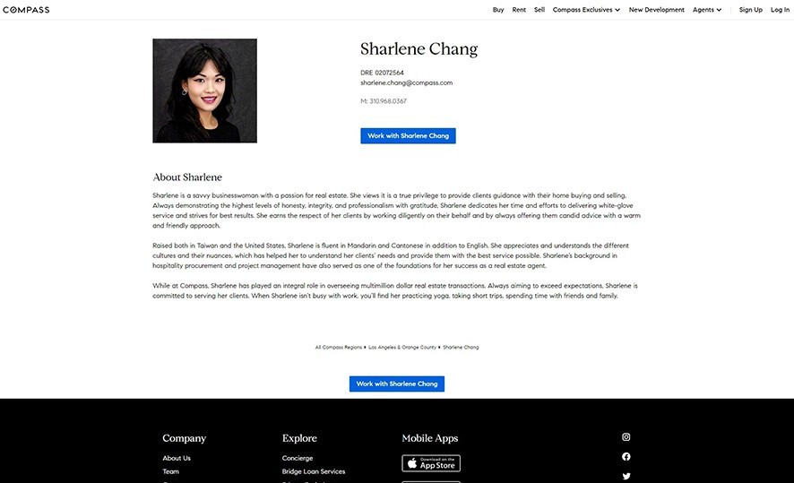
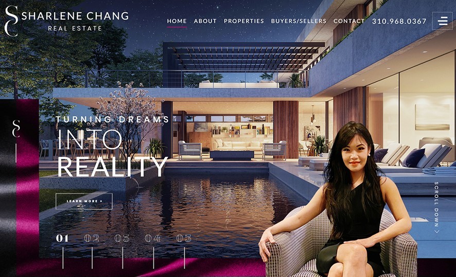
This was Sharlene Chang’s first time commissioning a website, so she wanted one that made a huge impact. To this end, we designed a site that had both polish and personality. It radiates a confidence that’s indicative of Sharlene’s mastery of Beverly Hills’ prestigious property market.
Ready to Read More?


