7 Stunning Before and After Real Estate Website Makeovers
A few months back, we showed you 6 incredible real estate website before and after transformations. Today that list is being updated with 7 more stunning before and after real estate website makeovers for you to feast your eyes on.
These websites do more than just make an outdated website look current and stylish. They also help to generate more leads, provide the website owners with reliable metrics to enhance performance, and much more.
Could you use some help revamping your real estate website? Have your online leads started drying up? Once you see what can be done with a professional real estate website makeover, ask yourself, ‘Could my website use a makeover?’ Take a look at these transformations and compare these websites with yours to find out.
#1: Ann Wilson Homes.com
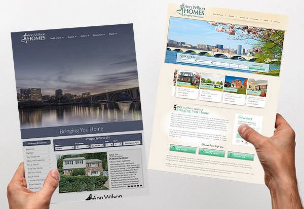
For an outdated website, the original annwilsonhomes.com was ahead of its time. Look at the expansive background image. The image quality could be better but it makes a good impression at first glance. But where this website falls short is in its responsiveness and mobility.
The new annwilsonhomes.com website uses a much higher quality background image above the fold to grab users’ attention immediately. The updated layout with the quick search bar immediately available, the proper use of image to draw readers down the page, and mobile capability incorporate the latest techniques in website design to great effect.
#2: Colson Agency.com
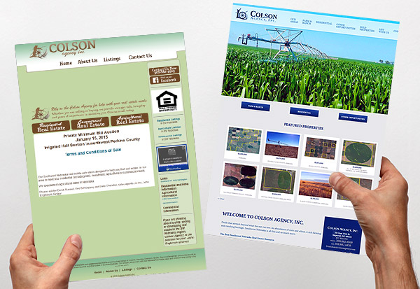
The old colsonagency.com website is the perfect example of how bad color scheme and a lack of high quality imagery can totally turn users off. The pea green background color with the coffee brown and tan font overlays are a recipe for disaster.
The new colsonagency.com tells the visitor that they sell ranch properties without using one word. Instead they let high quality scrolling photos in the banner splash to greet visitors with a winning first impression.
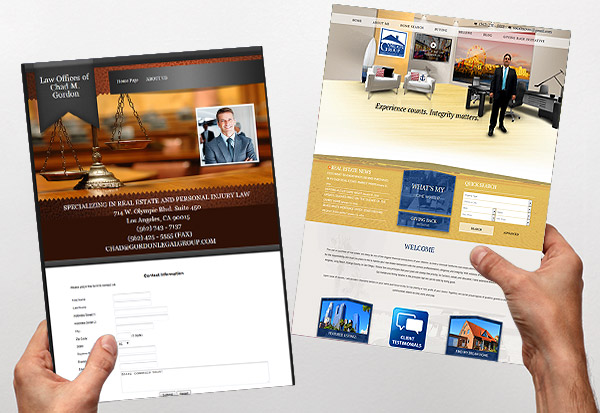
#3: Call Todd.com
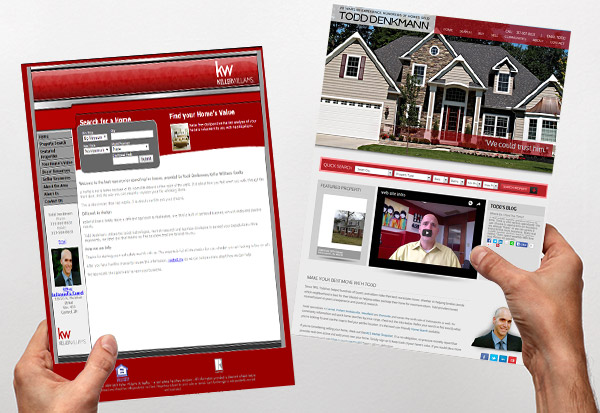
The old calltodd.com website epitomizes how font and layout can negatively affect a website’s perception. This website’s font is entirely too small and hard to read in gray. There are no quality photos on the front page and most importantly, it is not mobile capable.
Take a look at the new calltodd.com website. Upon entry the real estate firm’s brand logo is impressed in the visitor’s mind with this slick slow loading logo animation. The website is still quick and to the point but now the oversized background images tell visitors what the site is all about. Hidden menus, prominent branding and contact information, all come together to perfection in this real estate website makeover by Agent Image.
#4: Jenna DAmico.com
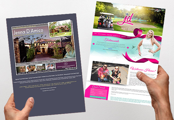
Close but no cigar. The old jennadamico.com website shows how parallax scrolling can go very badly if done incorrectly. The strain the overloaded scrolling effect has on the eyes is immediately noticeable. Beyond that, most of the text is unreadable because of poor font color choice.
After a website makeover the new jennadamico.com website uses much of the same color schemes but uses the parallax scrolling effect to perfection. Compare the two when you scroll. The new site sections off the text so that it is readable and the full screen background images are unobtrusively incorporated as static images as you scroll.
#5: Real Estate Miami Homes.com
Ten years ago the old realestatemiamihomes.com website would have been avant garde. In today’s real estate market it is a dinosaur. It does not use scrolling at all which makes it incompatible with mobile devices. Instead users must click through page after page to get to the information they need. Not to mention the fact that the fonts are too small and the images are lacking.
The new realestatemiamihomes.com website is fabulously modern. With scrolling luxury photo banner, featured community tiles, and a hidden menu bar that appears when you scroll down the page, the team at Agent Image was able to bring this real estate website into the “twenty-teens”.
#6: Haan Appraisals.com
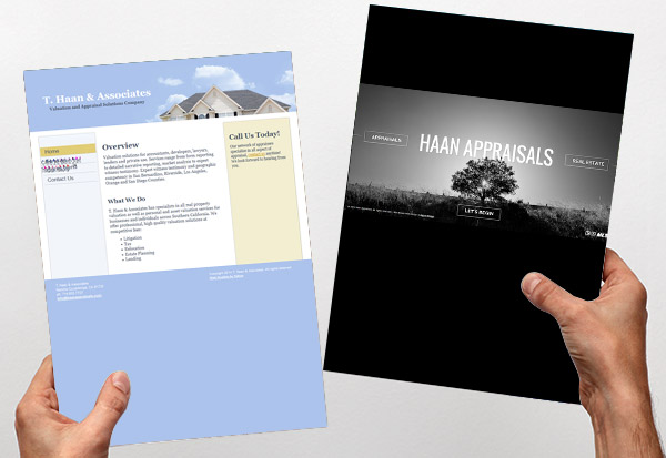
Even with the limited text, no one was going to linger on the old haanappraisals.com website for very long these days. Especially for a real estate professional who is selling a service and not the properties, it takes some nifty web design to keep visitors interested.
One way is to make it a quick presentation that takes less than a minute to relate to users. That is how the new haanappraisals.com website works. The polished entry design in sharp grays, whites, and blacks make this website hard to resist for both desktop users and particularly mobile users.
#7: Socal Moves.com
What does socalmoves.com do and how can they help you? You would never know from the old socalmoves.com website. The only way to find out more about their services is to call, email, or fill out the contact form. It’s not the only problem with this website, but it is definitely one of the biggest.
On the new socalmoves.com website visitors find out what they do and what they are about immediately. Agent Image uses fly out text in short bursts to tell visitors to the website how Socal Moves can be of service and what to do next. The menu across the top banner aids in easier website navigation.
The Real Estate Website Makeover Pros
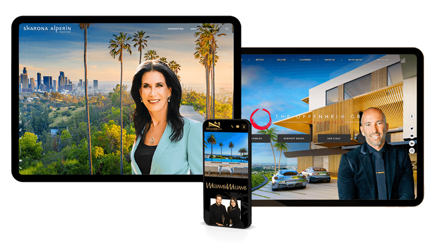
The thing that has kept Agent Image at the top of the industry for real estate web design is their penchant for staying ahead of technology. Many of the new advances for mobile, for color scheme and layout, and the proper use of property photos and videos was a staple of Agent Image website design long before it became standard.
When you turn to our team for your real estate website makeovers, you know you are getting help from the best. Some of the biggest producing agents in the country use our services to keep their real estate websites fresh, innovative, and generating leads.
If after comparing your website to some of our clients’ old websites you see a lot of similarities, it’s time to call in the real estate website makeover pros. Contact our team now for a free consultation.