Choosing the Perfect Color Palette for Your Real Estate Website
Can’t decide what color combination to use for your website revamp? Thinking about getting a new real estate website, microsite, landing page, or online brochure? Here are some helpful online tools to help you get the best color palette to complement your site’s branding and style.
Table of Contents
Can’t decide on the perfect colors for your brand?
Skip the guesswork and let us help you get that website project going!
Best Colors for Real Estate Websites
Your first step in choosing a color palette for your real estate business is to pick out your main color. You want something that represents your brand accurately because your real estate signage, logos, and marketing materials will all use your chosen color theme.
Color psychology factors into color choice just as location and culture may influence the meanings attached to different colors. For instance, in many parts of Asia, white is traditionally the color of mourning.
The real estate industry has oft-used colors because they represent ideals that agents want to express.
In addition to conveying a message, real estate signs need to be noticeable even from afar. People won't stop for a sign that's unappealing — they will pass by it. So whatever your chosen color might be, pick carefully.

Dominant Real Estate Colors
-
Blue
The number one color for real estate agents, blue is associated with dependability, honesty, trustworthiness, security, and strength. Look at the specific shade of the blue you like as it may have deeper connotations. For instance, teal or pale blue evokes the ocean — a fitting hue if you specialize in seaside properties.
Blue is a good choice for backgrounds, as well as for text, logo, or accent colors.
-
Red
The second most popular color is red, which symbolizes strength, bravery, and excitement. Fire engines are painted red as it is very eye-catching, and appears strong and confident.
Red can "vibrate" with some colors, however, making it unpleasant to read. Choosing the correct palette to use with red is important.
-
Black
The next top choice for real estate colors is black. Many high-end real estate agencies use black to represent elegance and sophistication. Black is also a good choice to highlight other colors.
Other Best Colors for Real Estate
-
Brown
Brown is an earth tone that suggests ruggedness and hominess, creating feelings of warmth and comfort. Brown and green immediately suggest nature, making that combination perfect for "green" homes or rural properties.
-
Green
Green is seen as a calming color. Like brown, the color green carries an earthy connotation of fertility and growth. Real estate professionals often choose green when selling family homes.
Like red, green does not work well with some colors and can be hard to read, so use it carefully.
-
Orange
Orange is popular in communities that feature beaches or oceans. Orange is an eye-catching energetic color that suggests sunshine and enthusiasm. Orange is better suited as a highlight rather than a main color as it can be a bit overwhelming.
-
Pink
Pink is a warm color that evokes youth. On the downside, it can be seen as childish. As such, it may function better as an accent color.
-
Yellow
The color yellow makes people slow down and focus their attention, which is why it's used for school buses. While yellow connotes warmth and cheerfulness, it can also be overwhelming or can fade into the background when mixed with the wrong color palette. It is likewise a great accent color.
-
Grey
Grey is cool and balanced. Mixing grey, white, and black can suggest elegance, formality, and credibility, so it is used in high-end real estate agencies. Grey creates a strong message when used as a highlight or background color.
-
Purple
There are a lot of purple hues with many different connotations. A classic rich purple suggests royalty and is often used for high-end real estate businesses. Other purples like lavender or pale purple evoke nostalgia and fun. Purple is a great accent but is less effective as the main color.
-
White
Like black, white is a versatile color. A white background makes almost any color stand out and makes dark-colored text easy to read. White accents make other colors pop, while white borders can define two colors that may be too hard to read otherwise (e.g. instance red and yellow).
-
Gold
The color of wealth, gold is a great accent color. If you are creating a real estate logo, use gold sparingly because it can be more expensive to print metallic colors like silver, copper, and gold.
Color Combos to Avoid
As you choose colors, there are some color combinations that you want to avoid. Some are simply not complementary and may even be difficult to perceive by those with vision problems.
-
Red and Green
If you have not dealt with color blindness, you may not realize that red and green are roughly the same for a person with this condition. Avoid putting one right next to the other. You can separate the colors with whites, greys, or blacks.
-
Light Green and Yellow
Separately or with another color this combo can be great. Together they can be dull as they are too close together on the color wheel. In addition, they can be hard for someone with color blindness to perceive.
-
Red and Yellow
Use this combination sparingly or tone down one (or both) colors.
-
Red and Blue
Not all reds and blues clash, but bright blue and bright red will "vibrate," causing eye fatigue and discomfort.
-
Blue and Green
This color combo causes issues for those with color blindness. Offset the colors with neutral hues.
-
Black and Bright Tones
A black background and bright tones might look really great, but for people with vision problems, including aging, those combinations are incredibly hard to read. Blue fades into black and other colors "vibrate" against it. In addition, on a computer or phone screen, the colors may not render perfectly and thus look unflattering.
-
Blues and Purples
Yet another combination that causes issues for those with color blindness or other vision issues. The combo is eye-catching, but hard to read. Use sparingly and as an accent with neutral colors to offset the two.

The Color Wheel
The color wheel is a way of organizing colors to show the relationships between primary (red, blue, and, yellow), secondary (orange, green, and purple), and tertiary colors.
The wheel is then used in color theory to determine complementary palettes.
A Few Definitions
As you read through the assessments, you may see some terms that need defining.
-
Hex color - A 6-digit code that defines every color. It allows you to pick the exact shade that will display on your web page or be produced by a printer. Hex codes are recognized in CSS, the coding language.
-
RGB - Red, green, and blue represent the three channels that create color on a computer monitor. While there are RGB codes, all are translated into hex for you.
-
HSL & HSV - Hue, saturation, and lightness/value is an alternate way of expressing the RGB color model. It's more intuitive as it closely aligns with how the human eyes see colors.
-
CMYK - Cyan, magenta, yellow, and black is the four color separation that printers use. If you've ever wondered why webpage colors do not print out exactly as they look on screen, it is because the printer is translating RGB into CMYK.
If all these colors and coding methods seem abstract, there are some great sources available to help you choose your color palette. Let’s take a look at these and how they can help you.
Color Palette Pickers
-
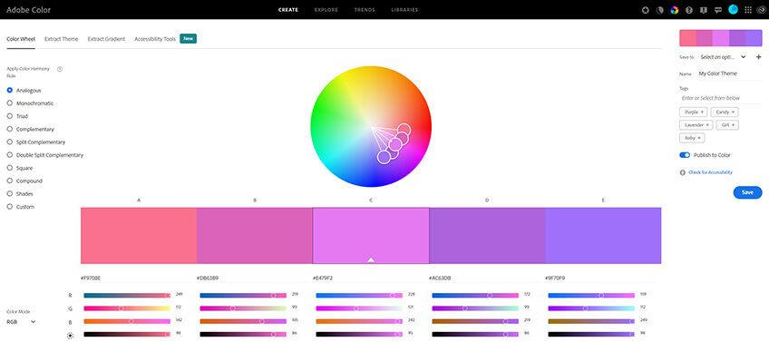
Adobe Color
A web-hosted application, Adobe Color allows you to create, browse, extract, and use color themes for various web or print projects.
You can search and browse color themes by tag word, title, creator, or hex color. Feedback and ratings may also help you decide on which theme to use. In mixing and matching your own colors, you can use the color wheel, harmony rules, and color sliders as aides. You can upload ideas from your computer or enter an image URL to extract its color palette. Whatever theme you make or choose, you can easily save the palette and download it directly to your desktop through Adobe AIR.
-
Khroma
Unless you’ve been living under a rock, you know that artificial intelligence is changing the game. Now, it’s also helping people translate their color preferences into actual color palettes.
When you first boot up Khroma, you’ll be asked to select 50 colors that you love. Don’t worry - a little chatbot will guide you on which colors to pick to make sure you don’t select ones that have bad contrast or don’t work well with each other. Afterward, the AI will create color combos that are displayed as grids. Found one you like? Simply click the heart icon to save it to your favorites.
Even better, there are five different views for the color combinations so you know if they’re suitable for what you want to achieve. These include type on text, poster, gradient, and palette.

-
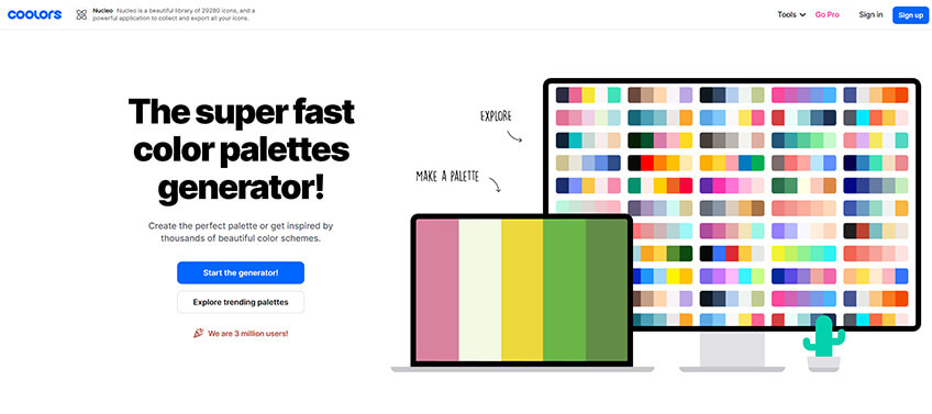
Coolors
Versatile is a word that perfectly describes Coolors. Available as a web-based tool, an iOS app, an Adobe Photoshop and Illustrator add-on, and a Google Chrome extension, this resource is clearly designed to serve a wide variety of users.
On its browser version alone, users can play around with free “Generate” and “Explore” functions to choose from a database of over 1,000 color combinations.
By pressing “Generate” a designer can view a series of color swatches, easily switching from one theme to the next at a tap of the space bar. Clicking “Explore” unravels a varied selection of color palette thumbnails for your perusal. You can either search by filter tag, or toggle between the site’s latest palettes, users’ highest-rated themes, and the Coolors team’s own picks.
-
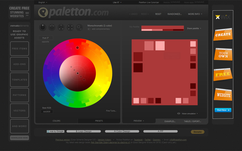
Paletton
Easily recognizable by its interactive color wheel set against a website's dark grays, Paletton is designed to truly make colors take center stage.
The browser-based tool gives designers free rein to play around with infinite color combinations using the interactive wheel. Users can set the wheel to select monochromatic, monochromatic with a complementary color, tri-color, and tetrad (4-color) variations and combinations. The tool even provides a randomizer that automatically generates suggested color palettes based on the user’s preferences.
-
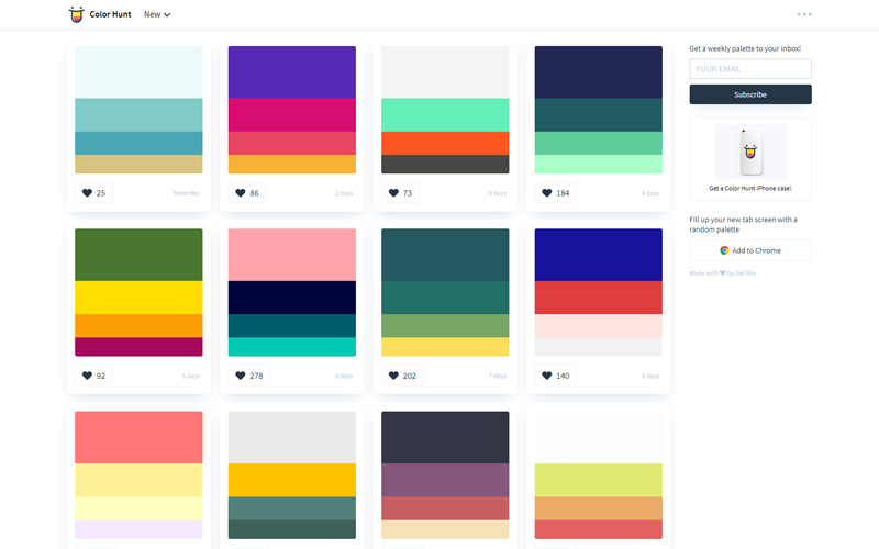
Color Hunt
If you're looking for a web-based design tool that does not beat around the bush, Color Hunt is perfect for you. Presented as large thumbnails, color combinations are regularly shared and updated on the Color Hunt main page. Designers will delight in the virtually limitless cascade of color design ideas here.
Worried you might forget to bookmark Color Hunt? The site makes sure you stay up-to-date with an email newsletter signup field. You can even add your very own Color Hunt Chrome extension to fill up new tabs with a fresh, random palette.
Frequently Asked Questions
Start by considering what message you want your brand to convey. For example, blue often symbolizes trust and professionalism, while green evokes nature and growth. Your main color will also be used across your signage, logos, and marketing materials, so it should align with your brand identity.
Be careful with combinations like red and green, light green and yellow, or red and blue. These can cause visibility issues, especially for those with color blindness, or lead to eye strain when viewed on screens. Balance strong colors with neutral tones for better readability.
There are many online tools to help create a color palette. Adobe Color, Khroma, Coolors, Paletton, and Color Hunt are excellent options for experimenting with different combinations and finding the best fit for your brand.
To ensure readability, use neutral backgrounds like white or light grey when incorporating bold colors like red, yellow, or black. Bright colors can be overwhelming or hard to read when used in large areas, so consider using them as accents rather than primary colors.
Color psychology plays a significant role in how visitors perceive your website. For instance, blue can make people feel secure and trustworthy, while orange can evoke energy and enthusiasm. Understanding these associations can help you create a website that resonates with your audience.
Still can't decide what colors to go with?
If all else fails, contact our in-house web design experts for an insightful consultation. Our Art Directors have years of experience working on thousands of successful real estate websites. Contact us at 1.800.979.5799 for more info, not just on the best website colors to go with, but also the best website layouts and marketing strategy to help you achieve your goals.