Best Real Estate Websites of August 2026: A Closer Look at Typography
Someone lands on a homepage and, before reading a word, already has a feeling about the brand behind it. Website typography plays a significant role in that. Serif or sans-serif. Bold or delicate. Playful or restrained. Every font on a homepage is a small decision that adds up to a big impression.
This month's roundup of eight websites show what great typography in web design looks like and how that choice carries over into overall brand identity.
Table of Contents
Best Websites of August 2026: Website Typography
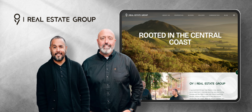
OV Real Estate Group brings a real estate practice built around Paso Robles wine country to the Central Coast market.
OV Group Paso Robles, CA
OV stands for Oak & Vine, and the design follows that name closely. The deep greens echo the oaks the brand takes its name from: steady, rooted, built to last. The bronze-gold gradients pull from the vineyards themselves, the color of a harvest shaped by years of care. Even the grotesque headline font fits, a little irregular at the edges, the same way a vine grows with intention but never in a straight line.
What’s unique about this website?
Every design choice ties back to the brand's own name— it’s an extension of the founders' philosophy.
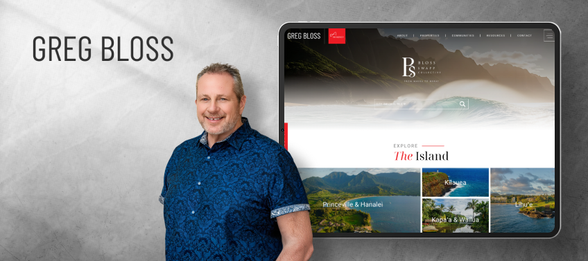
Greg Bloss has represented Kauai's real estate market with The Agency since 2003.
Greg Bloss Kaua’i, HI
Greg Bloss has lived on Kauai since 2003, and the site's photography shows it. Island landscapes, rock formations, and aerial shots carry the community section especially well. The rest of the design stays just as immersive: a serif and sans-serif pairing that looks simple but works well together, and fluid animations that add life. The Agency's signature red ties it all together.
What’s unique about this website?
All animations are smooth, seamless, and intentional, from parallax scrolling to hover effects.
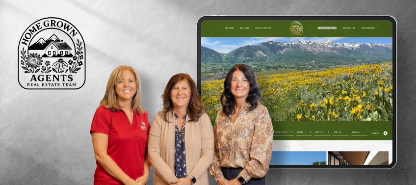
Serving Northern Utah's Cache Valley and Wasatch Front, Home Grown Agents operates under the ERA Brokers brand.
Home Grown Agents Eden, UT
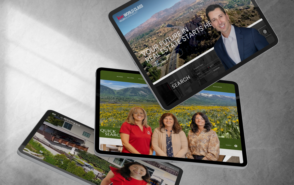
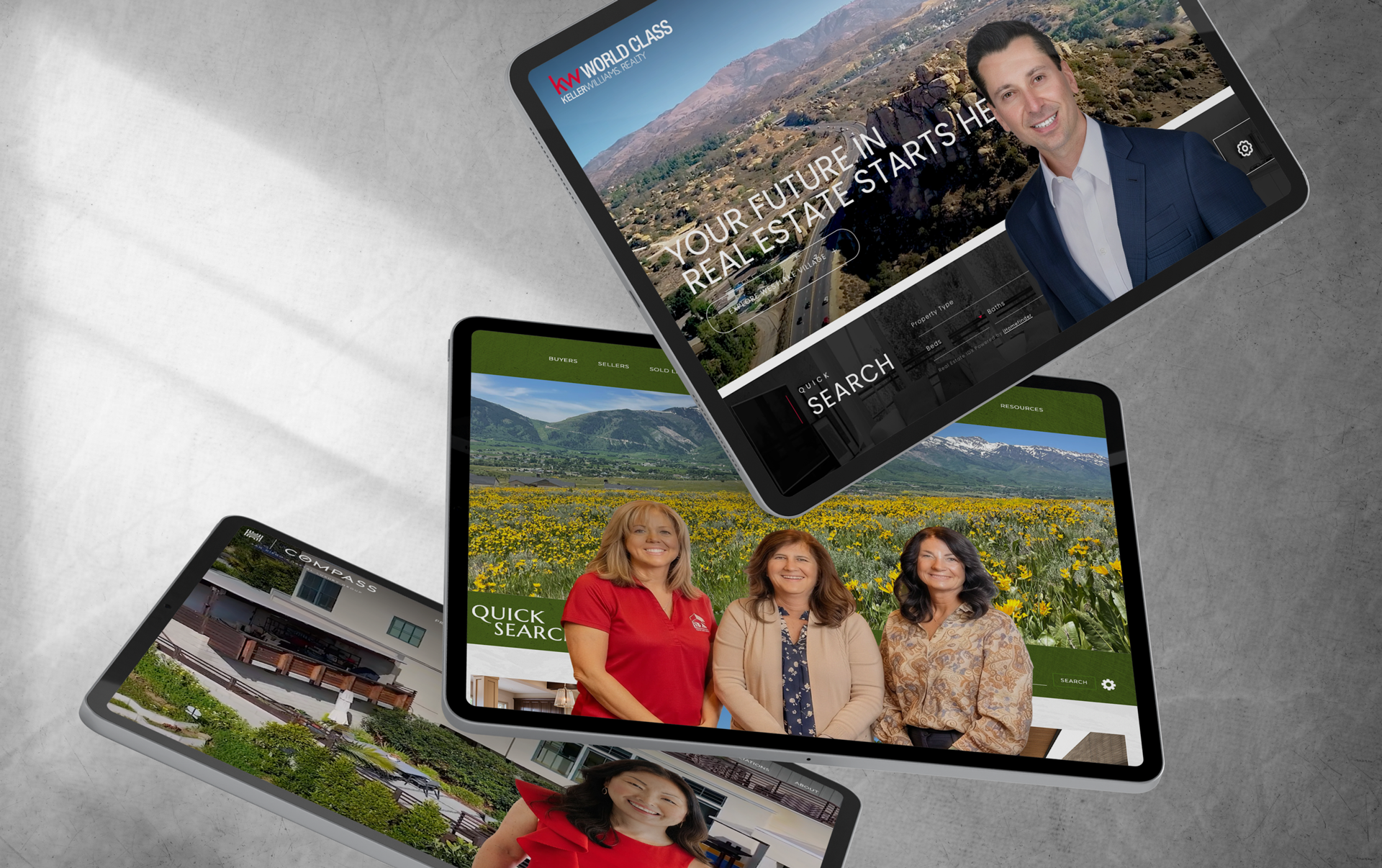
Home Grown Agents boasts a warm olive-and-gold palette, which fits a team that’s built on local roots and community rather than a big brokerage name. Despite its comforting familiarity, it’s clearly a sophisticated website. It uses a slender, elegant serif font for the main headers, with simpler sans-serif text carrying the labels and body copy. On top of that, whether you’re a buyer, seller, or just planning out your next steps, we made sure it’s a breeze to get where you need to.
What’s unique about this website?
There’s an interactive map of featured areas— hover over a city and you’ll see mountain terrain come to life.
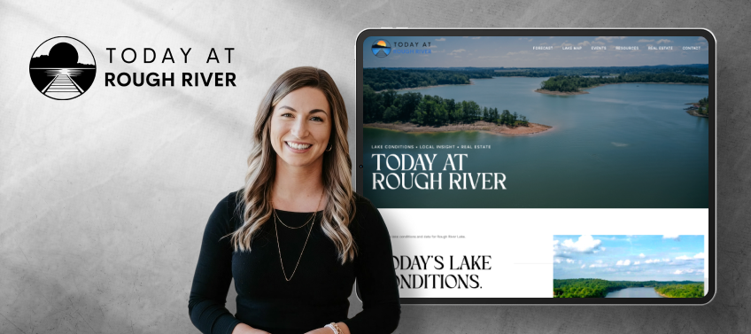
Alissa Doan built Today at Rough River to serve buyers and sellers around the Rough River Lake area of Kentucky.
Today at Rough River McDaniels, KY
Most real estate websites open with a headshot or an agent bio. Today at Rough River is not like most. Focusing on area first and agent second, Alissa Doan's website serves a specific buyer: someone who has already decided the lake is home, and just needs the details to take the next step. But make no mistake: design plays a crucial role in this data-rich website. That’s why we opted to use a bold, playful serif font for its headers and make it instantly memorable.
What’s unique about this website?
It uses clever design to make data engaging and easy to digest.
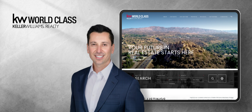
Led by Jordan Pearson, KW World Class represents ten communities across Ventura County under the Keller Williams brand.
KW World Class Westlake Village, CA
KW World Class's bold, condensed, all-caps sans-serif is confident and direct — a clear match for a team that covers ten communities across Ventura County. Black backgrounds, white type, and a red accent pulled straight from the Keller Williams brand mark carry that same directness through every section, right down to an interactive black-and-white map of the areas the team serves.
What’s unique about this website?
Agent photos sit in grayscale until a visitor hovers over one, at which point the photo snaps into full color.
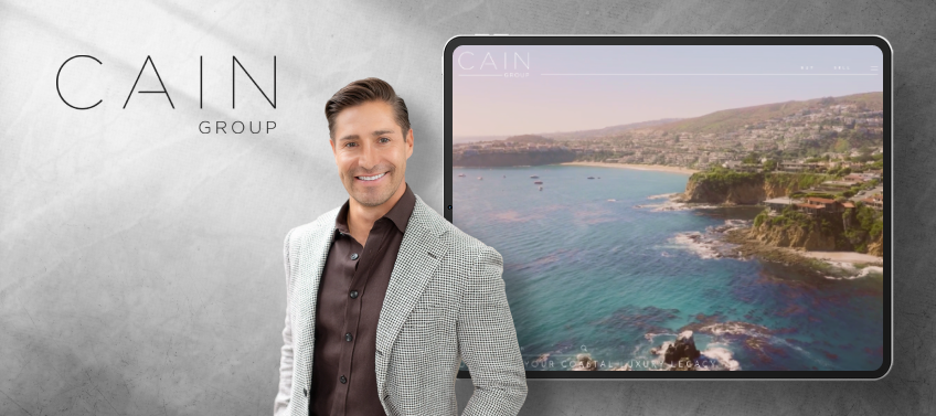
CAIN Group has spent more than two decades building a name in Newport Beach's luxury real estate market.
CAIN Group Newport Beach, CA
If good design tells a brand’s story, CAIN Group’s website tells one about legacy. Its thin, generously spaced headings lend the website a classic elegance that’s well-suited to a team that’s specialized in upscale Newport Beach for over 20 years. It’s also a masterclass in evocative imagery, with its color palette complemented by warm, sunlit landscape shots.
What’s unique about this website?
Full-screen videos stay in place as you scroll while the next section rises to cover it.
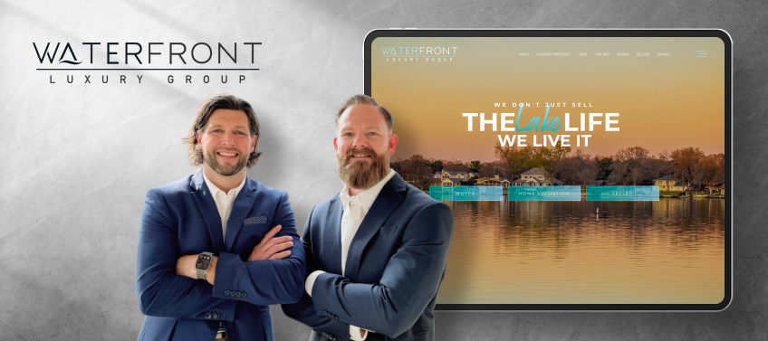
Chad Johnson and Ryan Switzer founded Waterfront Luxury Group to serve buyers across the Texas Hill Country's lake communities.
Waterfront Luxury Group San Antonio, TX
There’s more than one way to convey luxury, and Waterfront Luxury Group does it artistically. The hero section grabs attention with its sparing use of a handwritten brushstroke font, infusing color and life into their homepage. Indeed, founders Chad Johnson and Ryan Switzer are dedicated to conveying the “magic” that comes with lakefront living. The aquamarine and teal accents, coupled with choice lakefront imagery, add to that.
What’s unique about this website?
There’s a dedicated Lake Info page compiling important resources such as interactive lake maps and FEMA flood maps.
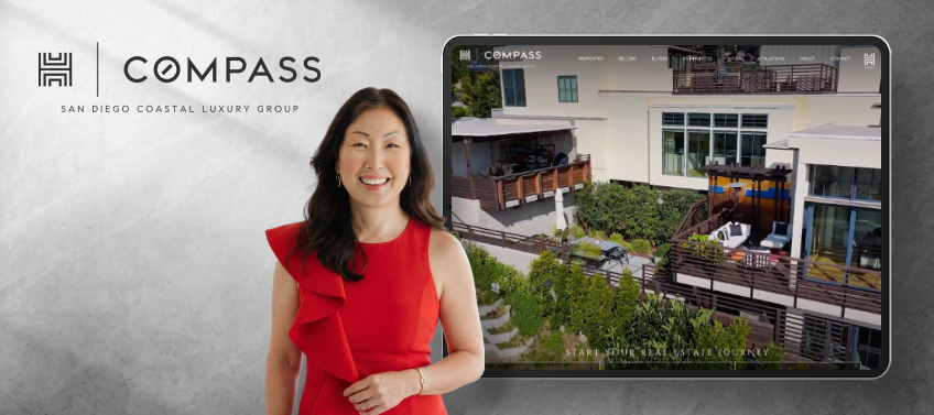
Julie Han boasts over 20 years of experience in San Diego luxury real estate.
Julie Han San Diego, CA
Julie Han’s website leans into sophisticated and minimalist design, so we decided to complement it with a geometric serif for larger text. Of course, there’s Compass branding through and through— especially in its use of the brokerage’s signature sans serif typeface. On top of that, you’ll notice that elements are revealed gradually as you go through the website, adding depth and dimension to the homepage.
What’s unique about this website?
Tasteful use of red accents to inject verve in the design while maintaining Compass’ signature black and white.
Tips Worth Stealing
Once again, this month's websites offer plenty of inspiration. Here are a few ideas you might want to bring to your own.
-
Let your brand name do double duty.
OV Real Estate Group ties every design choice, from font to color, back to the meaning behind its own name. If your brand has a story, your design should tell it. -
Make animation intentional.
Greg Bloss's website uses parallax scrolling and hover effects that are smooth and purposeful. -
Turn your service area into something interactive.
Home Grown Agents’ interactive map design ties into their rugged mountain aesthetic. -
Data doesn't have to feel like a spreadsheet.
Today at Rough River proves a data-heavy website can still feel approachable with the right design choices. -
Give visitors a reason to explore.
KW World Class turns a simple list of communities into an interactive black-and-white map, letting visitors explore Ventura County by clicking through each region the team serves. -
Let your visuals hold the spotlight.
CAIN Group goes beyond usual animations and uses fixed parallax for full-screen videos. -
Build a resource hub around what your audience actually needs.
Waterfront Luxury Group's Lake Info page compiles lake maps and FEMA flood data, giving buyers a reason to keep coming back. -
A small accent color can go a long way.
Julie Han uses tasteful red touches to add personality within Compass's black-and-white brand system.
Missed our Best Websites of July roundup? Take a look at the full blog here.
Transform Your Digital Presence
There's more to a great website than eye-catching design. Our team will take a close look at yours and show you what's holding it back. Book a demo or call 1.800.979.5799.